Published
Category
News
Introducing New Alby Brand Identity
We’re excited to unveil a refreshed look that better reflects who we are today and where we’re heading.
The Why Behind
What started with the Alby Browser Extension has grown into a whole portfolio. Since then, Alby has grown far beyond that first step.
Today, Alby is an ecosystem of products and tools that make using bitcoin effortless — in browsers, apps, and in person. From individuals to communities and businesses, we help everyone interact with money the same way they interact with information on the internet: freely and openly.
As our product family expanded — with Alby Hub, Alby Go and a growing number of developer tools — we felt the need for a clearer and more unified identity. One that distinguishes Alby the company from Alby the products, while bringing everything together under a single, cohesive vision.
This rebrand marks that new chapter.
What Guided the Rebrand
Our new visual identity is grounded in three principles: clarity, confidence, and openness.
We wanted Alby to feel simple, accessible and human, pointing towards using bitcoin for everyday payments, yet modern, innovative and open — a design language that reflects both the simplicity of good software for everyone and the strength of open protocols.
The New Logo — Meaning & Evolution
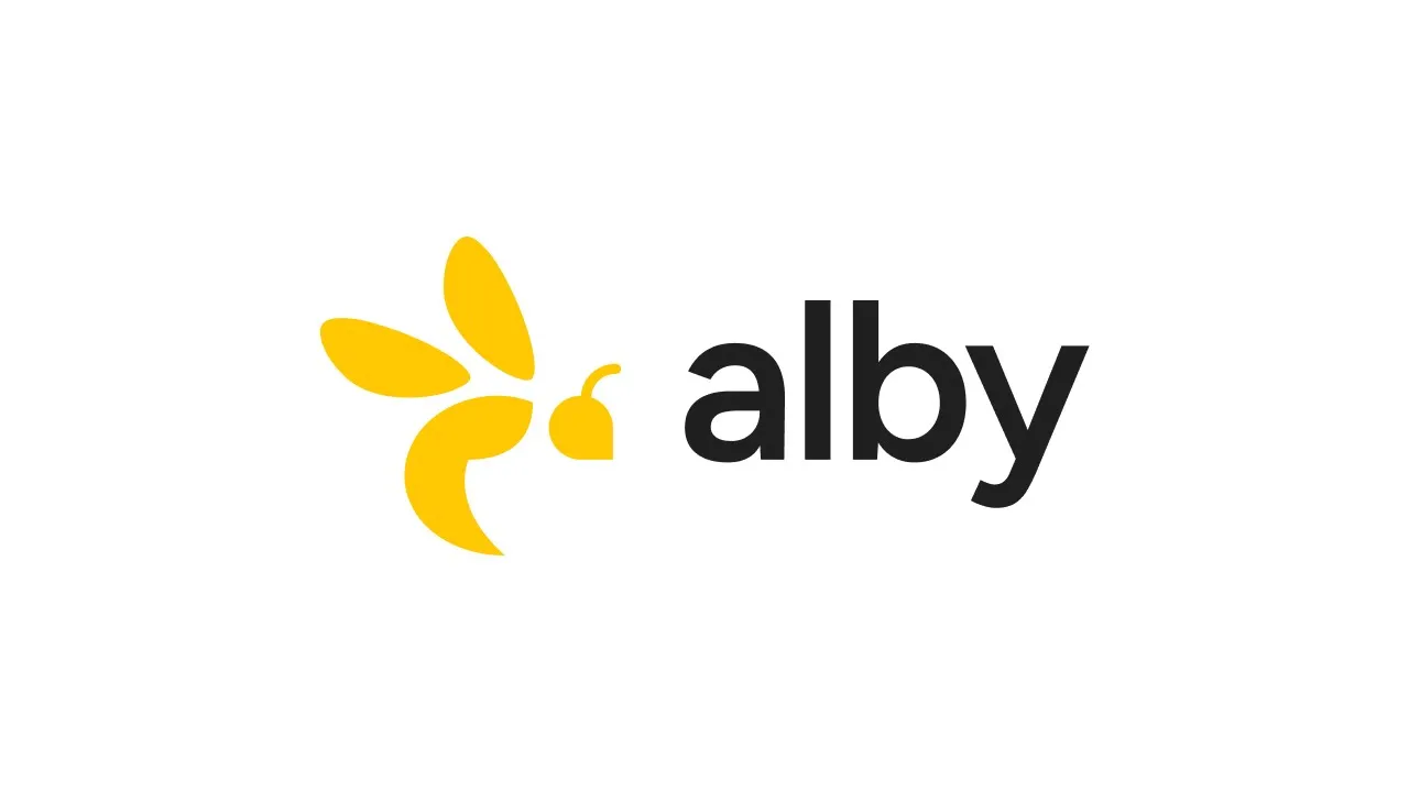
At the heart of the new identity is the refreshed Alby logo— simple, confident, and instantly recognizable.

The new logo simplifies our previous mark while keeping its essence — the bee. A symbol of cooperation, energy, and movement — the same principles that power open networks like Bitcoin.
Alongside it, each product now has its own distinct logomark — Alby Hub, Alby Extension, Alby Go — designed as members of one visual family.

Together, they form a cohesive ecosystem where every piece connects seamlessly to each other, but also with countless other open source bitcoin wallets, apps and tools, just like our tools do themselves. These shared design elements represent what Alby stands for: innovation, interoperability, and sovereignty.
The New Colors — Bitcoin for Everyday Life
We’ve introduced a calmer, more open balanced tone, led by a clean neutral base and thoughtful accents of Alby’s recognizable yellow. It brings a sense of peace with its simplicity and more sparse usage of our recognizable yellow brand accent. Designed to feel fresh, yet cohesive across everything we do.

The new-but-familiar colors express optimism, trust, and clarity — the same qualities we strive to bring to every Alby experience, empowering everyone with easy, open, and affordable payments.
What’s Staying the Same
While our look has evolved, our mission hasn’t.
We’re still building tools on Bitcoin that make it easy to earn, spend, and connect through value — in a self-sovereign and open way, just like the web itself.
The new design simply makes that mission clearer. It gives us a stronger foundation to express what Alby already represents: empowering individuals, creators, and businesses to take control of their money, integrate payments effortlessly, and with the freedom money Bitcoin is - unlock new possibilities for spending and accepting payments, like streaming sats to creators, exchanging value-for-value, or pay-per-use.

With Alby Hub at the core, you can enjoy seamless Bitcoin payments — on websites through the Alby Browser Extension, at merchants with Alby Go, and even in AI agents via the Alby Bitcoin Payments MCP server. For businesses and developers, Alby offers a comprehensive toolkit to easily integrate programmable Bitcoin payments into apps and services.
Ready for What’s Next
We’re thrilled to finally share this with you. You’ll start seeing the new logo and colors across our website, social channels, and products over the coming weeks.
We have matured as a brand and are more focused than ever to deliver the best bitcoin payment experience for all.
Thank you for being part of our journey — your support and feedback continue to shape who we are.
